


A Peek Inside My Dillard's Presentation
Hand-drawn sketches, color story, themes, and the early details that shaped my collection

Dear Reader,
Two weeks after that first DM, I sat down and presented my vision to Dillard’s.
It wasn’t just a moodboard. It was a feeling. A direction I could already see clearly in my mind.
The truth is, I’ve always had a strong intuitive sense for design.
As Rick Rubin puts it: I don’t know anything. I just trust my taste.
And I do. I know what I like. I know what I want. I know what makes something beautiful, lasting, and layered with meaning.
But when it came time to turn that vision into a presentation? I froze.
I had no background in graphics or InDesign. I couldn’t mock up my design ideas—at least not digitally. I didn’t even know where to begin.
But I studied words—I was a journalism major. So that’s where I began.
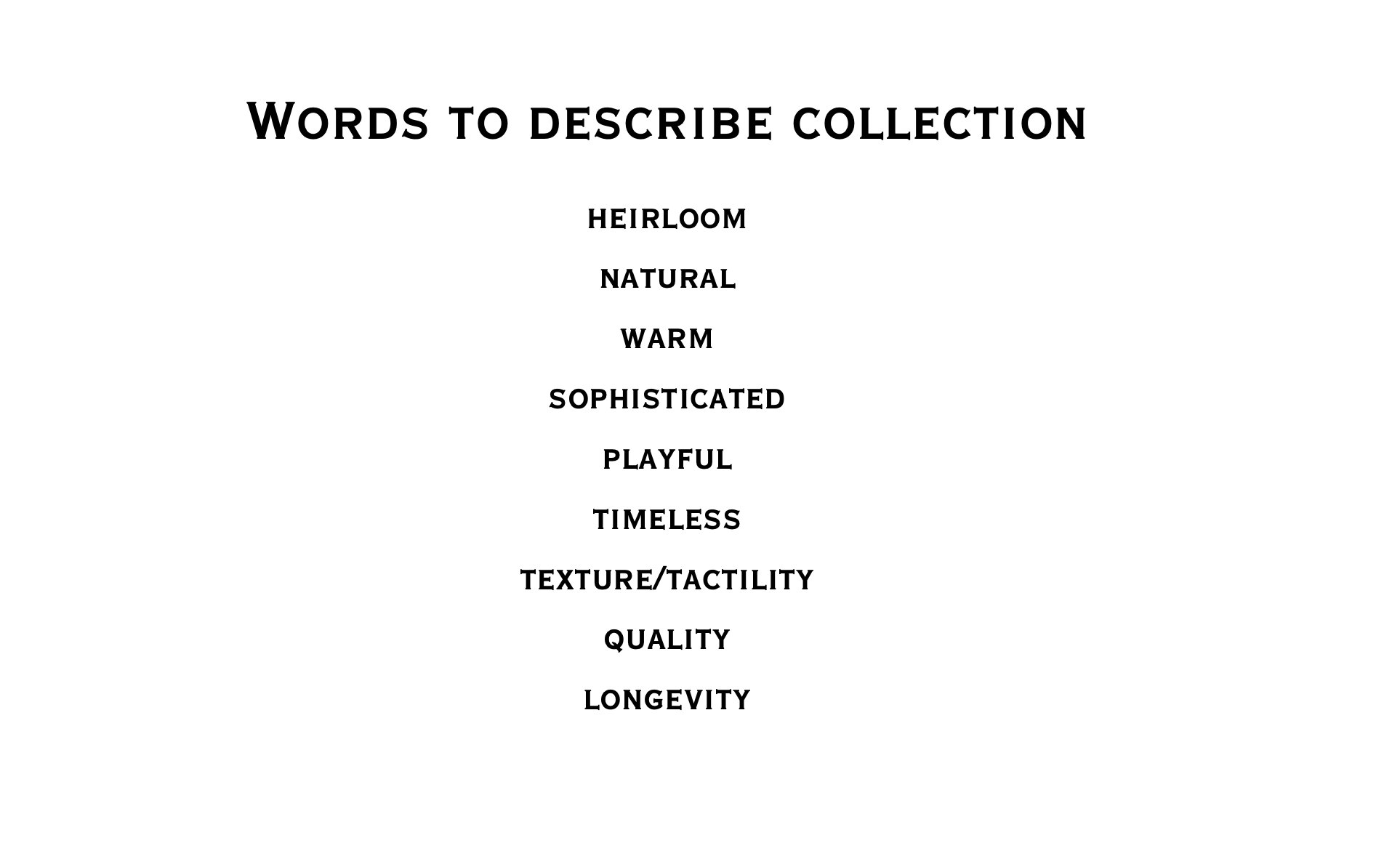
Below is the actual slide from my first presentation to Dillard’s:
From there, I went back to the drawing board—literally. I hand-sketched every piece: each silhouette, each detail I envisioned. Then I scanned them—pencil smudges, uneven lines, imperfections—and dropped them into the presentation.
It wasn’t polished. But it was personal. And honestly? I liked it better that way.
There was something about the analog nature of it that felt true to the spirit of the collection.
The slides included vintage references, natural palettes, fabric textures—everything tied to one simple idea: creating children’s clothing that feels timeless.
At the end of the meeting, they said they’d follow up in two weeks—with CADs.
I smiled and said, “Sounds great,” then immediately Googled: What is a CAD?
(It’s a digital rendering, in case you’re wondering.)
Below are images from my presentation:
Keep reading with a 7-day free trial
Subscribe to This Part of Me to keep reading this post and get 7 days of free access to the full post archives.